




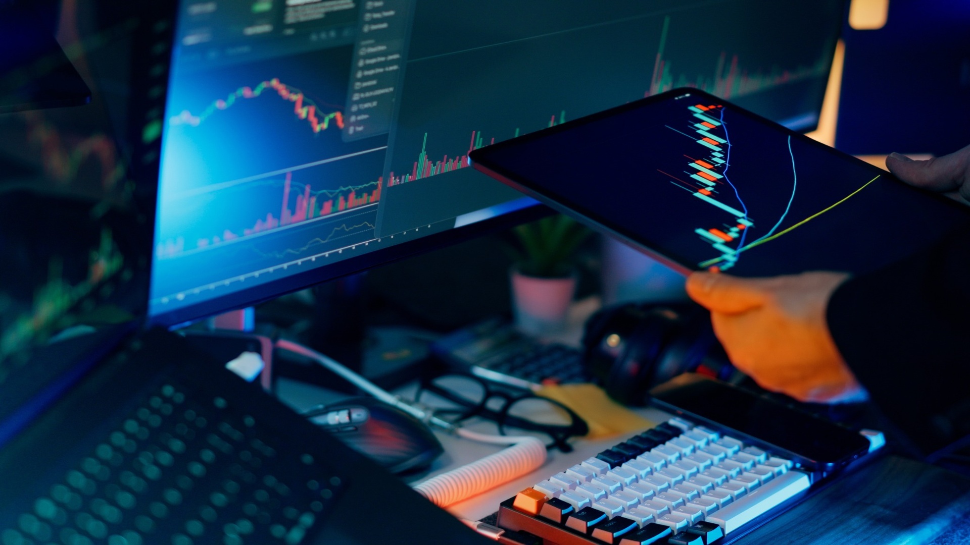
Open any financial app or news site and you will see a row of numbers with green and red arrows: the S&P 500, the Dow, the Nasdaq. For a beginner, it can look like a foreign language. The good news is that stock market indices follow a few simple conventions. Once you know what each number means, you can read the market in seconds. This guide walks you through it.
Understanding Index Points and Percentage Changes
The first thing you see is the index level, such as 5,200.00. This number is measured in points, not dollars. It does not tell you how much anything costs. It is a reference value that only becomes meaningful when compared with its own past values.
Next to it you will usually see two figures, for example +45.00 and +0.87%.
- Point change: how many points the index moved compared with the previous close.
- Percentage change: the same move expressed as a share of the index's level.
Always focus on the percentage. A 100-point move means something very different for an index at 40,000 than for one at 2,000. The first is a 0.25% change, a quiet day. The second is 5%, a dramatic one. Percentages let you compare moves across different indices fairly.
Color coding is nearly universal: green (or sometimes blue) means up, red means down. In a few markets, such as Japan and China, the colors are reversed, so check the app's legend if you follow international indices.
Reading an Index Quote Step by Step
A full index quote contains several data points. Here is what each one means.
- Last or current value: the latest level during trading hours.
- Previous close: the final level from the prior trading day. All daily changes are measured against this number.
- Open: where the index started when the market opened. It can differ from the previous close if news broke overnight, a difference known as a gap.
- Day's high and low: the highest and lowest levels reached during the session. A wide range suggests an unsettled day.
- 52-week high and low: the extremes of the past year. These show whether the index is near a peak or recovering from a slump.
By comparing the current value with the previous close, the day's range, and the 52-week range, you can tell in moments whether today is calm, volatile, or part of a bigger trend.
How to Read Stock Index Charts
Charts show how an index has moved over time, and they reveal patterns that a single number cannot.
Line charts connect closing values and give a clean view of the overall direction. They are the best starting point for beginners.
Candlestick charts show the open, close, high, and low for each period in one shape. The thick body shows the open-to-close range, and thin lines (wicks) show the extremes. A green candle generally means the index closed higher than it opened; a red one means it closed lower.
Time frames matter enormously. A one-day chart can look alarming while a ten-year chart shows a steady climb. Switch between one month, one year, five years, and the maximum range to place today's move in context.
Two extras are worth noticing:
- Moving averages, such as the 50-day or 200-day line, smooth out short-term noise. Many investors watch whether the index is above or below these lines to gauge the broader trend.
- Volume, shown as bars beneath the chart, reflects how much trading took place. A big move on heavy volume suggests strong conviction; the same move on light volume may be less meaningful.
Key Indicators That Add Context
The index level alone does not explain what is happening beneath the surface. A few additional indicators help.
Market breadth. This compares the number of stocks rising with the number falling. If an index is up but most of its stocks are down, a handful of giant companies may be doing the heavy lifting. Healthy rallies usually involve many stocks participating.
The VIX. Often called the "fear gauge," the Cboe Volatility Index measures how much volatility investors expect in the S&P 500 over the next 30 days. A higher VIX indicates more uncertainty, while a lower reading suggests calm. It is a measure of expected swings, not a prediction of direction.
Sector performance. Most data providers show how sectors such as technology, healthcare, energy, and financials performed. This tells you what drove the day's move.
Price versus total return. Headline index values usually reflect price changes only. A total return version includes reinvested dividends and gives a more complete picture of long-term results.
Common Mistakes Beginners Make
Reading an index correctly also means avoiding some typical traps.
Treating one day as a trend. Daily moves are noisy. Zoom out before drawing conclusions.
Confusing the index with your own portfolio. Your investments may behave very differently from the S&P 500, especially if you hold only a few stocks or a specific sector.
Focusing only on points. As explained above, percentages are the fair way to compare moves.
Ignoring the index's makeup. The Dow tracks 30 companies, the S&P 500 about 500, and the Nasdaq Composite leans toward technology. Each tells a different story, so check which index you are reading.
Reacting emotionally to headlines. Dramatic phrases like "plunge" or "surge" often describe moves of one or two percent. Look at the actual figure and the longer-term chart before reacting.
Frequently Asked Questions
What does it mean when an index closes higher? It means the weighted value of its member stocks ended the day above the previous close.
Why do indices change when markets are closed? The official index value does not, but futures contracts trade nearly around the clock and are often used to anticipate the next day's open.
Which index should a beginner follow first? The S&P 500 is a good starting point because it covers a broad share of the U.S. market.
Key Takeaways
Reading a stock market index comes down to a few habits: focus on percentage change rather than points, compare the current level with the previous close and recent range, use charts across several time frames, and add context with breadth, volume, and volatility. With practice, the daily market summary stops being a wall of numbers and becomes a clear snapshot of how investors feel.